

Loti Design Kit
Empowering Disaster Relief Through a Scalable Design System
Role
Lead Product Designer & Design Systems Architect
Project
Net new disaster relief insurance product
Duration
~6 months
Overview
This project showcases the end-to-end development of a comprehensive design system for the Loti Web Application, a pre-launch product offering designed to serve those in need during disaster relief. In a fast-paced startup environment, this system was crucial for delivering a cohesive and intuitive user experience.
The Challenge & My Role
As a small team of four, we faced the unique challenge of building a net-new product in the disaster relief space, an area largely unaddressed, and with a critical deadline to launch before California's wildfire season. My primary task was to design the application from the ground up, with a specific focus on establishing its design system.
I thrived on this challenge, which demanded quick iterations, adaptability for evolving features, future scalability, and efficient developer handoff. Though new to building a design system from scratch, I leveraged my background in product design, branding, and architecture to construct a robust and scalable system. This foundational work was pivotal in accelerating development, ensuring brand consistency, and empowering the company's future growth.
Vision & Principles
The Loti Design System was built on core principles of scalability, ease of use, and speed of implementation. These guiding tenets informed every design decision, ensuring the system delivered a clear, consistent, and uniform product experience that felt thoughtful and cohesive, not piecemeal.
Color Palette: Harnessing HCT


We opted for an HCT (Hue, Chroma, Tone) color palette for the brand and system. This choice provided several key benefits: it enabled future dark mode implementation, offered flexibility in brand expression, and ensured strong alignment with accessibility guidelines (WCAG).
Typography: Lexend for Clarity

Our typographic choice, Lexend, was selected for its free-to-use license, san-serif clarity, and robust range of weights. I then developed a systematic approach for its application across headlines, body copy, and captions, providing clear guidelines for consistent usage throughout the product.
Core Components: Building Blocks of Consistency
To illustrate the system's principles and complexity, here are some key components.
Buttons

Purpose: Buttons serve as critical calls-to-action, guiding users through the product towards their goals.
Design Decisions: We designed buttons for flexibility and consistency, leveraging our defined HCT color palette.
States & Variants: The system includes primary, secondary, and ghost buttons. Each group features default, pressed, and disabled states, with the added ability to flex in form and incorporate icons.
Note: Main color variant shown; additional button colors available per brand guidelines and use cases.
Cards
Purpose: Cards were the key unifier across the product experience, ensuring a consistent design for diverse use cases on different pages.
Design Decisions: We highlighted Photo, Document, and Expense cards as these represent the primary ways users add home inventory items. Consistency in their design was paramount as we anticipated new use cases.
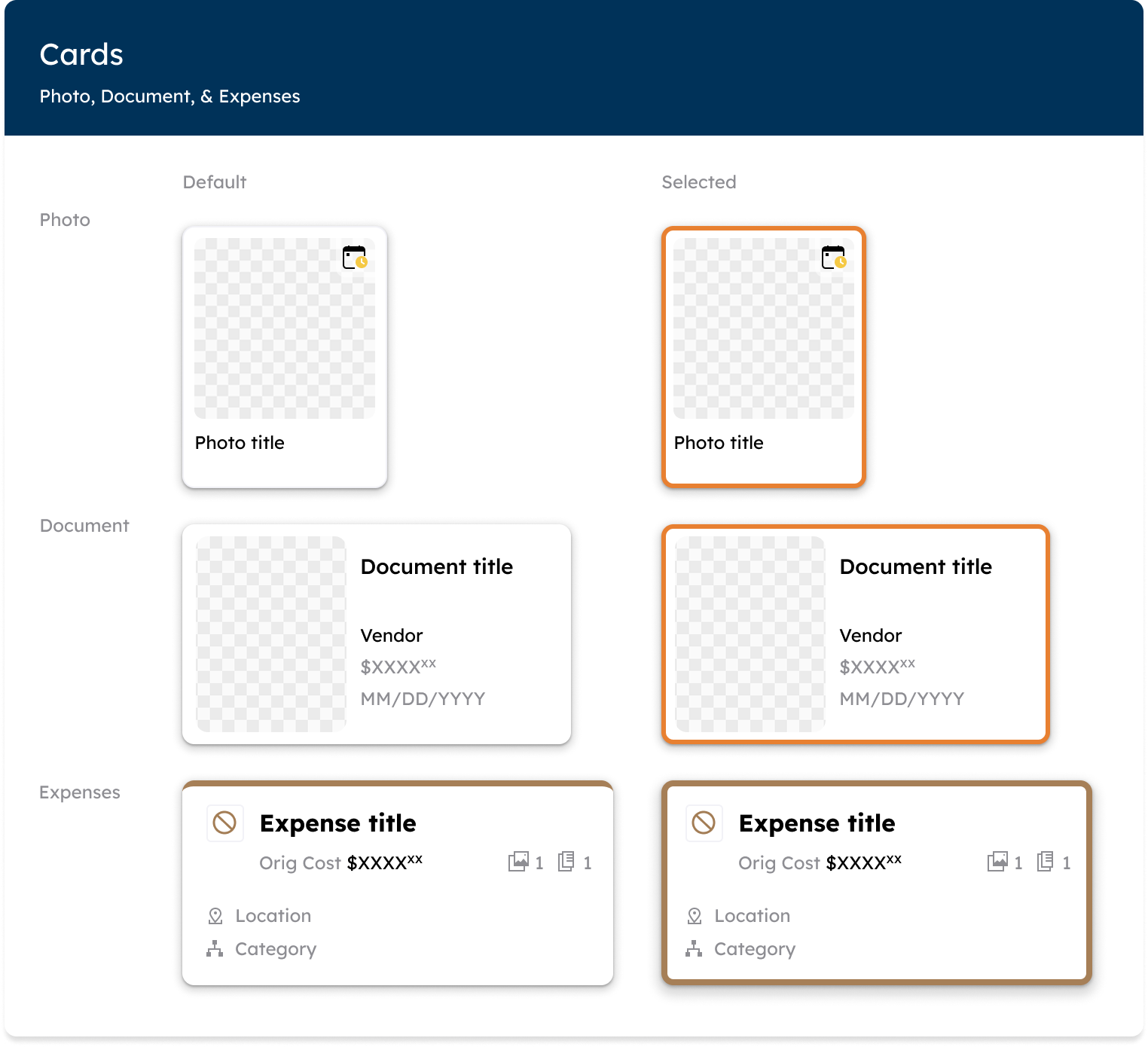
Document cards: Designed like business cards, they display a photo, selection state, and relevant document information for receipts, invoices, etc.
Photo cards: Based on 3mm cards, these prioritize the photo, with a small tile and top-right calendar to indicate incident timeframe.
Expense cards: A robust system of business-card inspired designs, colored by loss, purchase, service, or replacement. Their states include selected, error, and bookmarking.
Note: Expenses card displays Total Loss variant; multiple designs exist for different expense categories.
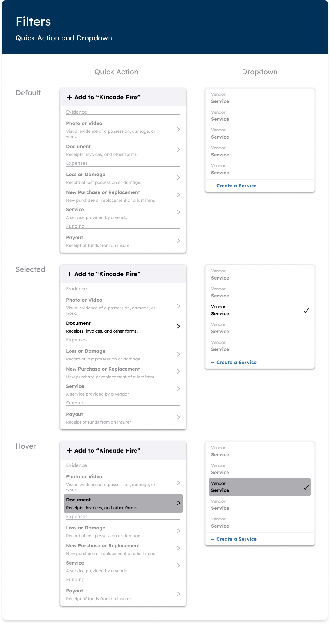
Filters
Purpose: Filters manage large sets of options, presenting them to users as a clear, manageable, and relevant selection set.
Design Decisions: Filters were designed to be visually distinct with elevated drop shadows, minimal color use, and clearly defined states.
States: Despite numerous use cases, filter states (default, selected, hover, pressed, disabled) were standardized to ensure consistency across all product pages.
Note: Services dropdown shown; component has several variants across application spaces.
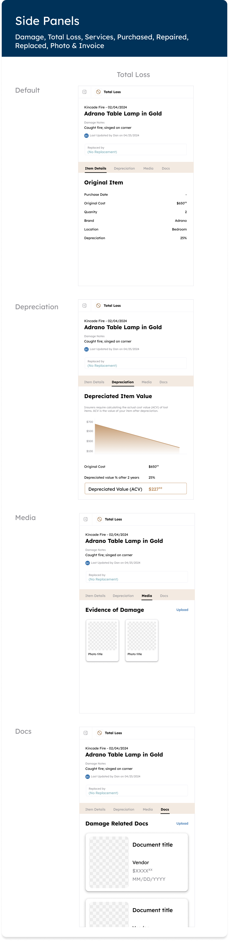
Side Panels
Purpose: Within the expenses experience, selecting an expense card triggered a side panel to detail the card's composition.
Design Decisions: Given the robust number of design states and pages within the panel, consistent designs for each tab were critical.
States: The main states were open and closed. The open state comprised four key tabs, varying by use case, but consistently highlighting elements like item details, repairs, depreciation tables, financial breakdowns, and photo associations.
Note: One side panel design displayed; 70+ variants exist across the system.
Handoff, Process, & Collaboration
The entire system was built in Figma, where I created a dedicated System Library for designers and a Documentation file for developers. Through frequent communication and the creation of detailed specifications, the components were smoothly handed off and subsequently built in Storybook. I held bi-weekly meetings with our front-end developer to discuss progress, implementation nuances, and any gaps identified from his end. This continuous communication and collaboration ensured the system was built efficiently and effectively.
Outcomes & Impact
Though a pre-launch product, the Loti Design System has already delivered significant benefits:
Reduced design debt
Accelerated development cycles
Ensured consistency in early prototype designs
Fostered a meaningful and efficient collaboration with developers
This robust design system positions Loti for future growth and expansion, promising faster go-to-market times, reduced development costs, and a consistently clear user experience.
See the System in Action!
I'm excited to discuss how my experience in building scalable design systems can contribute to new opportunities. Stay tuned for the launch of the Loti Web Application in July 2025 to see the full design system in action!